Genially - Democratizing interactivity and how my professional career evolved

Product design & growth: from startup to global benchmark with +100 employees and millions of users
Overview
Role: From support and graphic design to UX/UI designer & UX researcher
Timeline: Almost 7 years of hypergrowth.
Key Metric: Systemic evolution and segmentation of Genially. Scale from a 3-person team to +100 employees and millions of active users in two critical verticals: education and corporate.
Achievements
Business impact: I was part of the team that took the platform from 0 to millions of users and a structure of +100 employees. I helped transform a generic tool into a leading interactive creation platform, reducing initial abandonment by personalizing the experience and applying a scalable design system.
Time-to-value: We managed to significantly reduce the time needed to find initial value thanks to dynamic segmentation.
Operational efficiency: Designing solutions that accelerated the handoff and improved the quality of delivery in critical functionalities.
Professional learning: This journey allowed me to live the evolution of a startup from scratch to a big company and evolve from a support role to becoming a product designer with a business vision. I learned that good design is not just aesthetics, but systemic empathy and real problem solving.
Business context and challenge
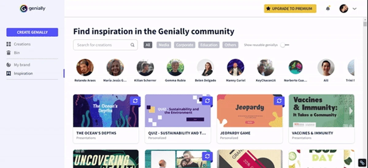
The challenge: Years ago, creating interactive content was the exclusive province of experts or designers in complex tools or Powerpoint. Genially was born to democratize the "magic" of interactivity. However, explosive growth brought a strategic challenge: we attracted two opposite worlds (education and corporate) with the same entry door.
The pain: The "feature creep" and the lack of segmentation. A business director looking to create a pitch deck was faced with geography templates for elementary school. This cognitive friction damaged activation and distanced us from enterprise customers. The risk of becoming a “Frankenstein” tool (powerful but unusable) grew as we climbed.
The mission: Actively participate in the evolution of the product towards a scalable model, professionalizing the interface and executing the segmentation of the onboarding experience to maximize the perceived value from the first contact.
Discovery and research
My entry into the product was transversal. I started in support, answering user issues and creating tutorials, and graphic design doing some templates for the platform. This operational base became my analytical superpower when making the jump to the product team.
I analyzed thousands of tickets to understand that users were not asking for "more buttons", they were asking for less cognitive load. I knew every frustration because I myself helped users overcome them in real time. So investigating how context changed the use of the tool. While teachers searched for “gamification,” corporate profiles searched for “dossiers” and “microsites.” And usability tests revealed that novice users were scared by complex interfaces. One of my job was to help design power hidden behind simplicity.
Relevance is retention. If we don't speak the user's language in the first 15 seconds, we lose it. An this is how we discovered the "user activation". It wasn't complete the sign up, not using a template and of course not click on "Like" in Facebook's post. They key was users wanted to publish and share their wonderful creations. Later on time, some of the users spent hours and hours doing stuning creations like escape rooms, microsites, massive interactive presentations, elevator pitch, etc.
Product and design strategy
To accompany the growth of the company, I worked under a design approach based on three fundamental pillars, where the key was the deep research of our users to break down the experience::
Profiling and personalization research: I led the analysis of different types of users and their specific usage patterns. This research was the basis for breaking down our audience and designing a personalized onboarding that responded to the real needs of each segment from the first contact.
Progressive disclosure (modular complexity): I designed the interface to be "simple by default, powerful on results.
Source Targeting: I implemented an intentional friction step at registration by asking “Who are you and what you'd like to create?” This allowed us to apply dynamic templates curation.
Corporate profile: Dashboard with priority on reports and sober aesthetics.
Educational profile: Priority on training templates and vibrant aesthetics.
Onboarding flow
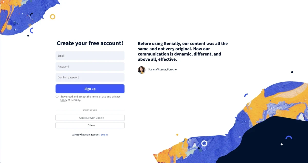
Step 1: Registration and initial capture
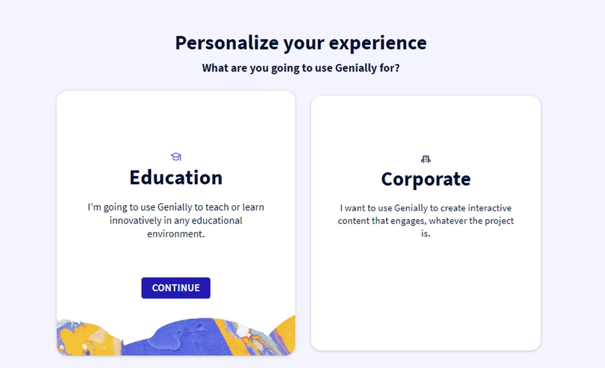
Step 2: Sector Selection (Education vs Corporate)
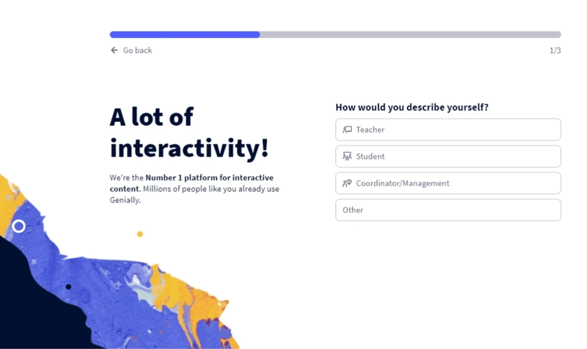
Step 3: Identify the specific role
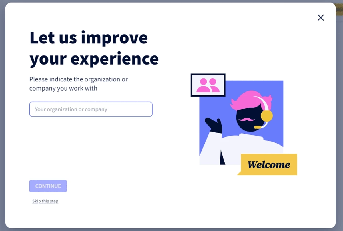
Step 4: Final customization of the experience
Step 5: Showing personalized templates based on sector and role
Execution and development
The evolution culminated in the redesign for Genially 2.0, a process where I worked at the intersection between design, marketing and development.
Onboarding iteration: I designed the rapid profiling flows that fed our CRM. This improved UX and allowed the sales team to identify high-value leads automatically.
Content taxonomy: Organized and mapped thousands of templates to each user profile together with the content team, solving the "blank canvas" problem by offering custom templates depending the sector and role.
Strategic help center: I developed and managed the help center, transforming recurring doubts into self-help articles. This reduced the support burden by 70% and allowed constant feedback to be captured for the product team.
Support and continuous training
After completing the onboarding, the user was accompanied with tours and tutorials so that they learned not only how to use Genially but also how to create content with engagement.
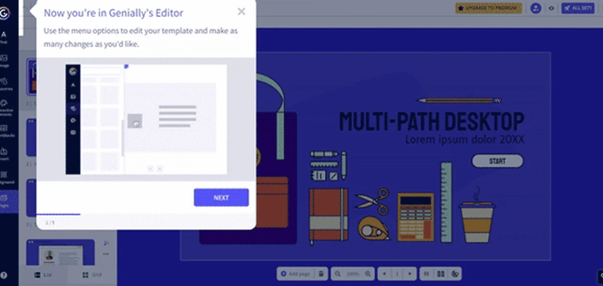
Guided tour
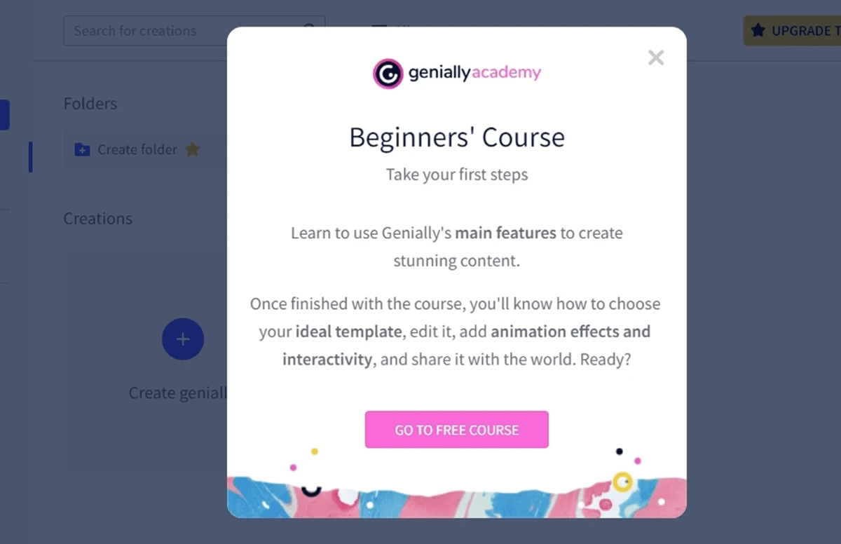
Link to learning experience